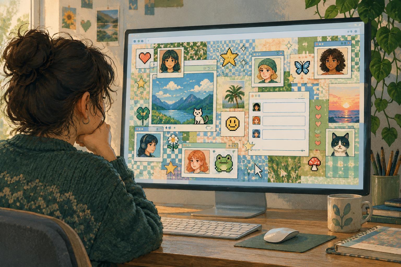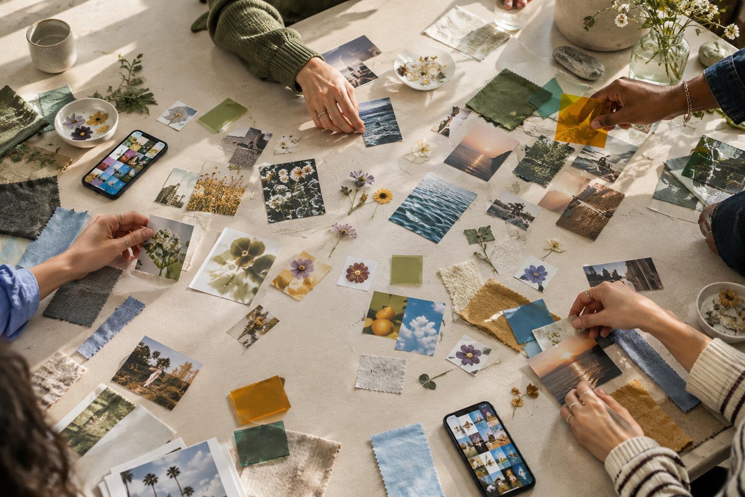
An aesthetic starts as a pattern people notice
A photograph of a rainy street, a muted outfit, and a playlist cover might have little in common at first glance. Put them alongside similar posts, though, and viewers may begin to recognize a mood. Online aesthetics often develop this way: people collect images, sounds, objects, and references that seem to belong together, even before anyone agrees on a name for them.
The pattern does not need a rulebook. One person might focus on lighting and color, while another notices clothing, typography, or the settings where images are taken. Repeated choices make the collection feel coherent. A viewer can then borrow one cue, such as soft focus or a particular silhouette, without copying every detail.
That flexibility helps an aesthetic travel. If participation required an exact set of objects, fewer people could adapt it to their own lives and creative work. Loose patterns leave room for interpretation, which is part of why a visual idea can appear across photos, videos, illustrations, room decor, and profile designs.
Shared cues make a mood recognizable
Visual cues act as shortcuts. Color can suggest warmth or distance; framing can make an ordinary place feel intimate or theatrical. Clothing, props, fonts, and editing choices add further hints. None of these elements has a single universal meaning, but repeated combinations teach an audience what to expect from a particular look.
Context matters as much as appearance. A cup on a desk might be an incidental detail in one post and a central part of a carefully arranged scene in another. Captions, music, and the surrounding posts can shift how viewers interpret the same image. Online, an aesthetic is often experienced as a sequence of examples rather than as one definitive picture.
Creators also rely on contrast. A style becomes easier to identify when people can describe what it is not: polished rather than casual, nostalgic rather than futuristic, spare rather than crowded. Those comparisons can be useful, but they are imperfect. Real posts frequently blend cues from several styles, and a creator may be experimenting rather than declaring allegiance to a category.
Labels turn resemblance into a conversation
A name gives people a way to point to a pattern. It can help someone search for references, describe a creative goal, or ask others whether an example fits. Once a label circulates, people may start making work with that label in mind. The name does more than describe an aesthetic after the fact; it can influence what the aesthetic becomes.
Labels also compress complicated influences into a few words. That makes them convenient, but it can flatten differences. Two people using the same term may mean different things, and a label may gather images from distinct communities or traditions under one tidy heading. When the origins of a look matter, it is worth paying attention to specific creators and contexts rather than treating the name as a complete explanation.
Disagreement is normal. Some people use labels playfully, while others want clear boundaries. Rather than asking whether every image passes a strict test, it can be more revealing to ask which cues people keep returning to and what the label helps them express.
Participation changes the look over time
An online aesthetic is not simply copied from one post to the next. Each person selects the parts they can use: a color treatment, a way of arranging objects, a setting, or a tone of voice. Someone working with a phone camera and everyday surroundings may interpret a look differently from someone designing a staged shoot. Both can add to the audience’s understanding of it.
Platform formats shape those choices. A small profile image rewards instantly legible colors and shapes; a short video can build a mood through movement, sound, and pacing. A saved collection can place many related examples side by side. As people adapt an aesthetic to different formats, some cues become more prominent and others fade.
Popularity can also change how a label feels. When more people recognize a style, creators may exaggerate its clearest features to make their work readable at a glance. Others may deliberately mix it with something unexpected. This back-and-forth keeps an aesthetic from being a fixed template, even when its name remains familiar.
How to read an aesthetic without reducing it to a checklist
To understand a look, begin with observation. What colors, compositions, materials, settings, and sounds recur? Which details seem essential, and which vary from post to post? Then consider how the label is being used. Is it helping people find inspiration, signaling membership in a community, or offering a quick description for an audience?
Look beyond the most polished examples. Casual experiments and mixed styles can show how people actually use a visual idea. Pay attention, too, to whether a label credits the communities and creators whose work helped shape it. Aesthetic names are useful maps, but they are not substitutes for the people and histories behind the images.
The most interesting question is often not whether a post belongs in a category. It is how shared cues let strangers recognize a mood, remake it with their own resources, and talk about what it means. That process turns a loose resemblance into a living piece of internet culture.