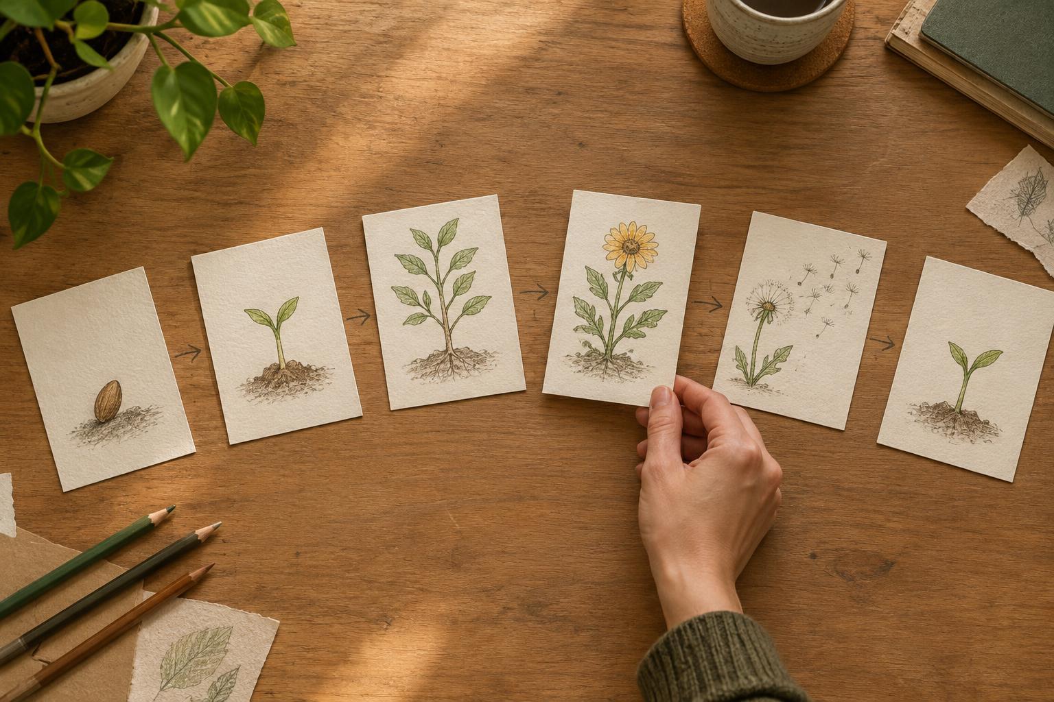
Start with a change, not a list
A carousel gives readers control over the pace: they can stop, go back or leave after any slide. That makes each panel an opportunity to deepen their understanding, not simply a place to fit another sentence. Before designing anything, write down what changes between the first slide and the last. Does a confusing process become manageable? Does an initial assumption give way to a better question? Does a small problem lead to an unexpected solution?
For a practical example, imagine a carousel about making a cramped balcony more usable. “Balcony tips” is a topic, but it is not yet a story. “I wanted somewhere to sit, but every layout blocked the door” gives the sequence a problem to work through. The ending might show a layout that preserves the walkway. That change provides a test for every slide: does it help the reader understand the problem, the choices or the result?
Give each slide one narrative job
Sketch the sequence in plain sentences before choosing images or typography. A useful plan might be: establish the goal, reveal the obstacle, show the first attempt, explain why it fails, introduce a better constraint, show the revision and share the takeaway. The exact number of slides can vary. What matters is that each one changes what the reader knows or expects.
In the balcony example, a photo of the space could establish its size. A simple overhead sketch could reveal that the door needs a clear path. A mock-up of a wide chair could show the tempting but impractical first choice. The next slide could replace it with a narrower seat and explain the trade-off. These are not several ways of saying “small spaces need planning.” Each panel adds a piece of information that makes the following choice meaningful.
If two adjacent slides do the same job, combine them or find the missing step between them. If one slide has several jobs, split it so the reader has time to absorb the point.
Make the reason to swipe specific
A transition works best when the current slide creates a clear question that the next slide answers. “Here’s what happened next” may keep the sequence moving, but it says little about why the next panel matters. “The chair fit on paper, but the door couldn’t open” sets up a concrete problem. The following slide can then show what changed.
You do not need a cliffhanger on every panel. Repeated suspense can make a simple explanation feel stretched. Vary the connection instead: a question followed by an answer, a plan followed by a test, a close-up followed by a wider view, or an assumption followed by its consequence. Give the reader enough information to feel oriented while leaving a purposeful step ahead.
Let the visuals carry part of the explanation
A storyboard is not just a script cut into rectangles. Decide what readers can understand at a glance and what requires words. In the balcony sequence, a marked-up floor plan may explain the blocked doorway faster than a paragraph. Text can then name the lesson: measure the path you need to use, not only the object you want to add.
Keep a consistent visual reference so readers can follow what is changing. If a layout rotates, furniture moves or a diagram changes scale, make that shift obvious. Otherwise, a reader may spend their attention decoding the graphic instead of following the story. Short labels and legible contrast can also help the sequence remain clear when viewed on a small screen. Important meaning should not depend only on a subtle color difference.
Test the sequence without its polish
Before finishing the design, read only the slide headlines in order. They should form a rough but coherent account of the journey. Then cover each slide in turn and ask whether removing it creates a gap. If nothing is lost, the panel may be decorative, repetitive or better suited to a caption.
Finally, check the ending against the opening promise. A carousel that begins with a blocked doorway should show how the final layout deals with it, not drift into generic decorating advice. The last slide can name the principle the reader can use elsewhere, such as planning around movement before choosing furniture. That gives the story a resolution and makes the takeaway useful beyond the example.